Stonyfield Packaging
®Stonyfield Yogurt package update case study.
.png)
The Goal
I hope to achieve a playful, bright, and friendly package design that coincides with the current the ®Stonyfields brand guides. I planned to use fun letter typefaces with vibrant colored illustrations. The challenge will be to simplify the current product design, keep ®Stonyfields original branding, but make the packaging more fun and stand out from the current yogurt competitors.
Challenges
®Stoneyfields has an organic yogurt pouch that to me seems a bit all over the place design wise. The challenge will be to simplify the design, keep ®Stonyfields original style, but make the packaging more fun and stand out from the current competitors In the dairy aisle.

Discovery
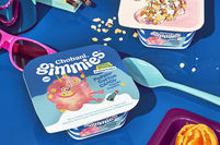
During my research phase before sketching out packaging designs, i had to find out what the competitors were doing. Some yogurt brands like ®Chobani Kids were vibrant with illustrations. Other yogurt brands kept it minimal with a monochrome color palette. Based on my research illustrating their way to keep up with the current hottest brand. I just needed an idea that would be the first pick. I went on to find imagery that inspired a workflow. Fruit patterns came to me. Strawberry was going to be my first flavor I would create. I thought why not make strawberries!
Sketches
For The first flavor profile I sketched some "Strawberry Beat Berry '' designs. I wanted to keep the original yogurt flavor name because it thought it was fitting for kids. I imagined the packaging being a literally cartoon drawn strawberry with its teeth being the flavor name. Thought about strawberries splattered on to the packaging or mini strawberries simply being nosy.
Months have passed after finishing the Strawberry design that I came up with "Bouncin Banana". This sketch was a bit easier to do since i had a template design already from creating the strawberry design a semester before. I just had to keep up the momentum.


Branding Elements
For the ®Stonyfield yogurt design I wanted to use a playful typeface. Originally I wanted to create my own typeface and plan on doing that in the future. But during that semester juggling multiple classes (5 to be exact and homeschooling my kiddo) time would not permit such a task. Instead I searched the internet for the most childish typeface options I could find. I kid you not ( ha dad a joke) I had a 3 page list of possible font choices. I narrowed it down to 2. Arco for my headers and Baloo for text. The color palette came easy since I made illustrated fruit packaging. I wanted to stay true to the strawberry and banana colors. When making the original Strawberry design I illustrated the strawberry skin on my iPad. I used the Procreate app of course. Its illustration of heaven over there! Months later I Illustrated the banana skin. I made sure to add some cute banana bruising AKA freckles to the illustration.
#F3DE21
#9C0526
#00ADEE
#630118
#3B2314
#262262
#4A7814
ARCO
abcdefghijklm
nopqrstuvwxyz
0123456789

abcdefghijklm
nopqrstuvwxyz
0123456789
Baloo

Solutions
Alright so for the packaging, the first round for my Strawberry pacakging was a bit scary. Sorry that I don't have that file anymore, but imagine a pair of eyes staring into your soul. Thats not friendly at all. The feedback I got from it was to add something else to the eyes so that it didn't look so creepy. I agreed so I added eyebrows, outlined the eyeballs to give the face more dimension, outlined the lips (because the teeth were floating off the page). Everyone loved how the second round came out. I honestly got minimal feedback. I just had to continue fixing my nutrition facts. I am not a copyrighter. Spring semester 2021 I made the banana packaging. I decided to simplify the eye design on the banana packaging compared to the strawberry. I felt the beady eyes on a banana seemed more banana like and it paired well with his freckles and red lips.
Round 1
-.png)


Presented solution for 1st flavor profile.
Round 2

2nd flavor profile
The Final Design
.png)
.png)
_.png)

.png)
.png)
Whats Next?
Boy, Im proud of my work! I think I mastered the fun, friendly vibe I was going for. every-time I see my rebrand Im hungry. I really love making food packaging. The freedom of creativity is endless. What's next for me, I'm creating a 3 flavor. I have a blueberry in the works, he needs a lot more attention so when Im done cosmetic surgery I'll add him here to the family.
.png)
_.png)


